Repackaging The Pill / Concepting / Curation / Design / Editorial Layout / Winter 2019

Final book cover
For this project I chose a podcast to present in a book format. The 99% invisible podcast episode “repackaging the pill” encapsulated my interests of the history of birth control and the negative past it comes from. With this article about the birth of birth control and its unique packaging I could explore how I could make a book to mimic the packaging idea. Also I wanted to highlight gender inequalities that existed from this ground breaking pill that was supposed to free women and allow them control to their bodies.
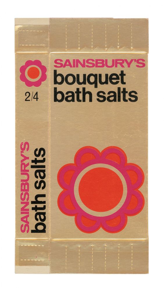
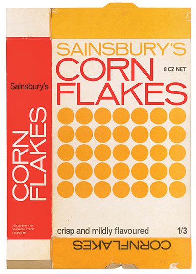
While exploring visuals for my mood board I came across a lot of graphics from the 1960’s that I was drawn to. I loved the bright colors set with Helvetica-esque type. I also loved all the geometric shapes that were used on packaging for miscellaneous items. I also looked at a lot of early birth control packaging for visual vocabulary inspiration. I loved the round motifs from the pack to the pills themselves. Some of the packs also came in pinks and blues that helped me narrow down my color scheme. I also looked at blue and pink as my color choices because it referenced the stereotypical boy-girl palette.
For typeface exploration I looked for a dramatic display typeface for the cover and different parts of my book- I came across Beatrice Display and found it to be perfect because it was reminiscent of some of the 60’s type. Its thickness reminded me of some birth control ads I came across during my research. As for my body copy and pull quotes I decided on a sans-serif that could be simple enough to compliment the bold Beatrice display yet mimic the text seen often in 1960’s graphic design, this being Work Sans.
Refining the book I spent a lot of time creating new spreads that were less static and more compelling to someone that may stumble across the book and just flip through without reading. This included adding more images to the spreads and pulling out moments that I found important to the narrative of the podcast. I also spent time testing colors and paper to see what printed best because it was always so unexpected.
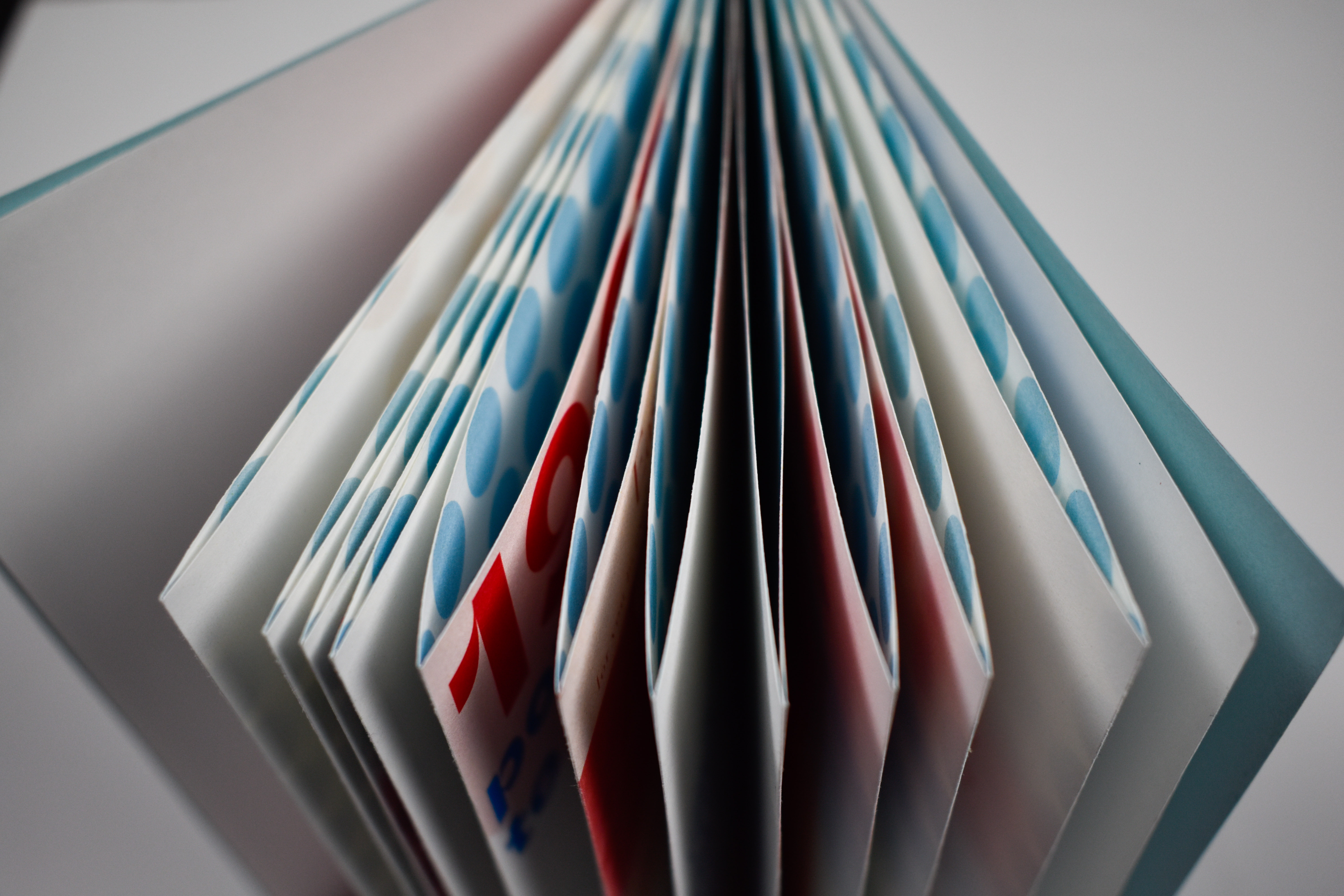


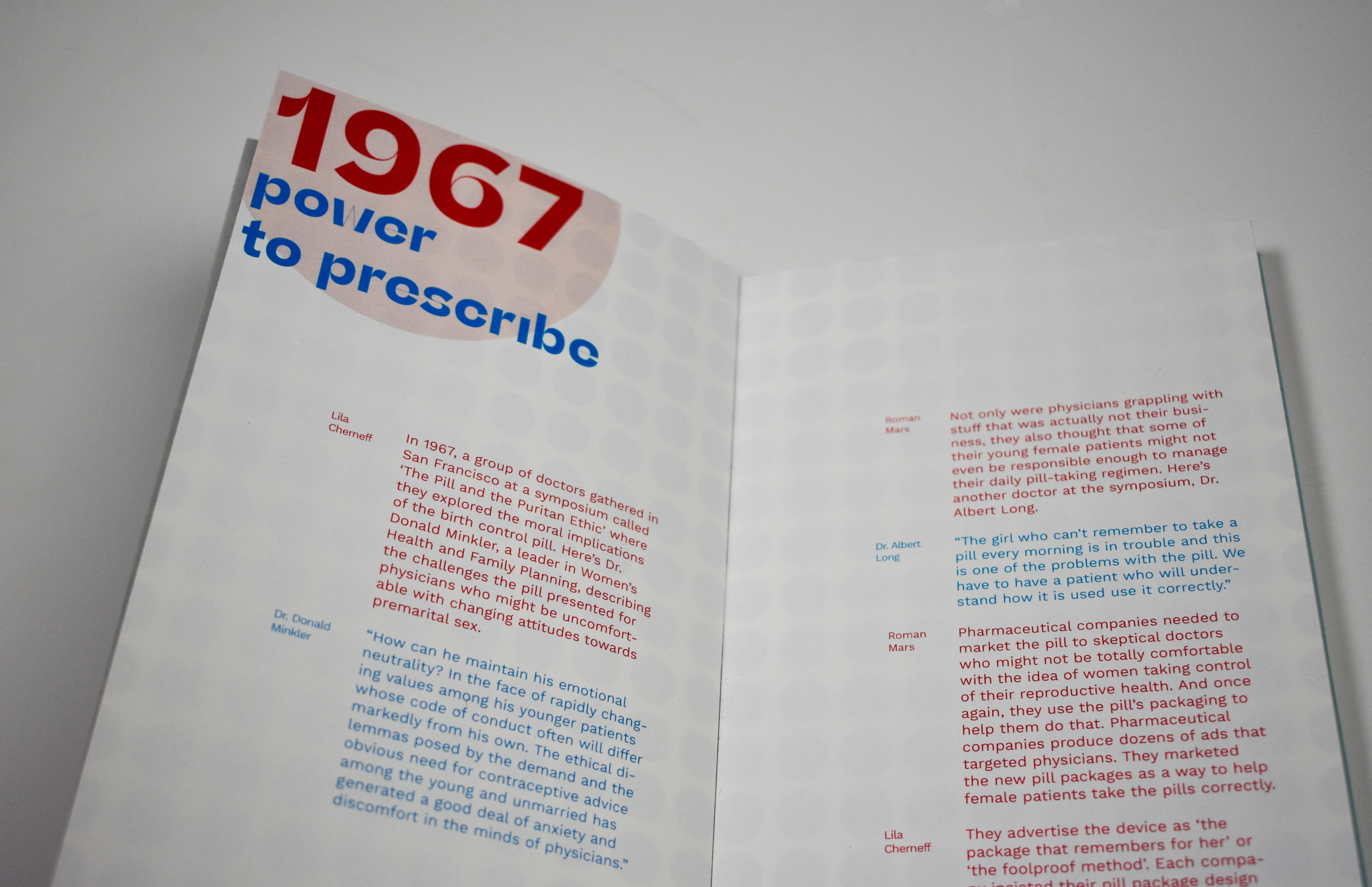
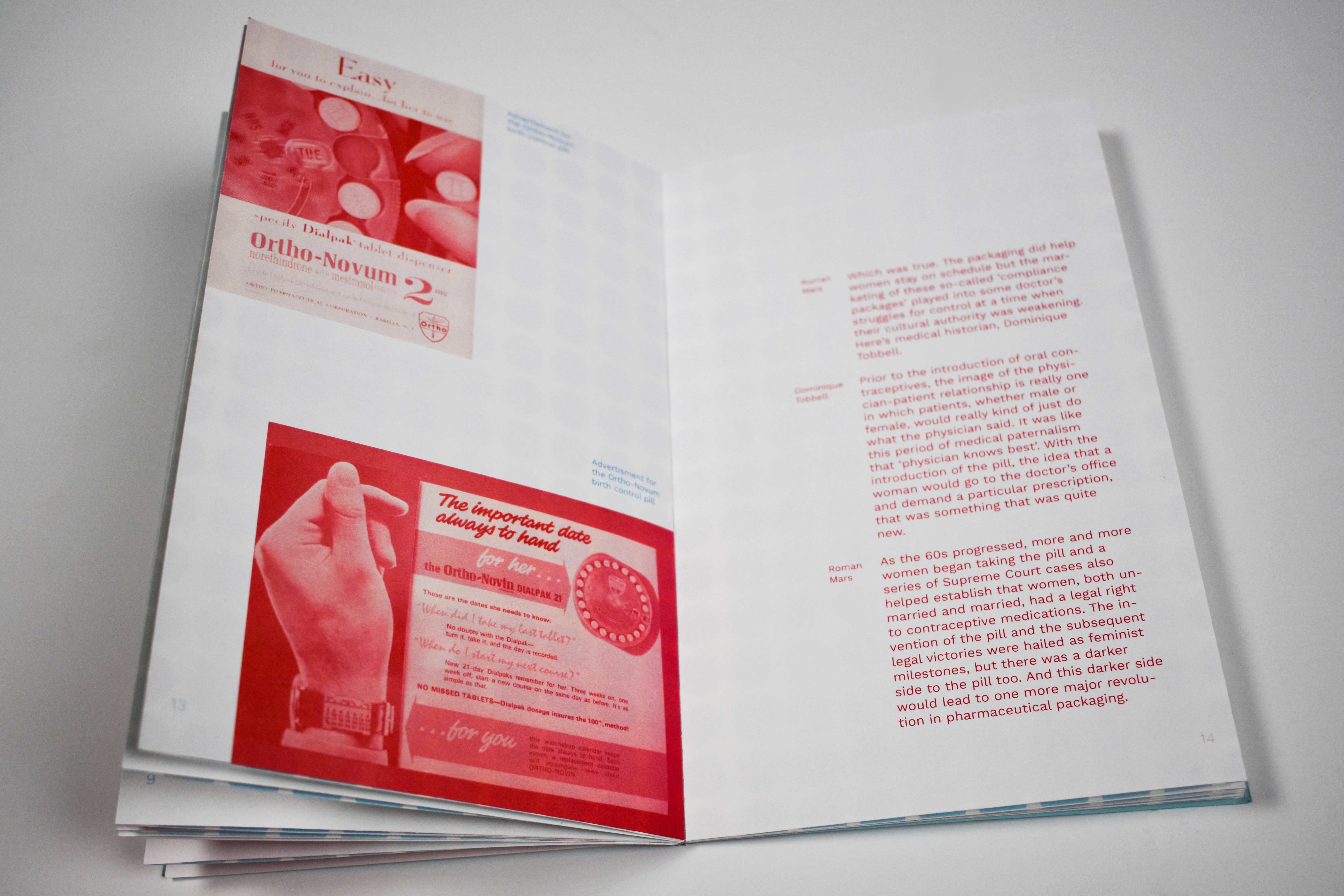
 Final Spreads