La Specola Rebranding / Spring 2019
 Final collateral
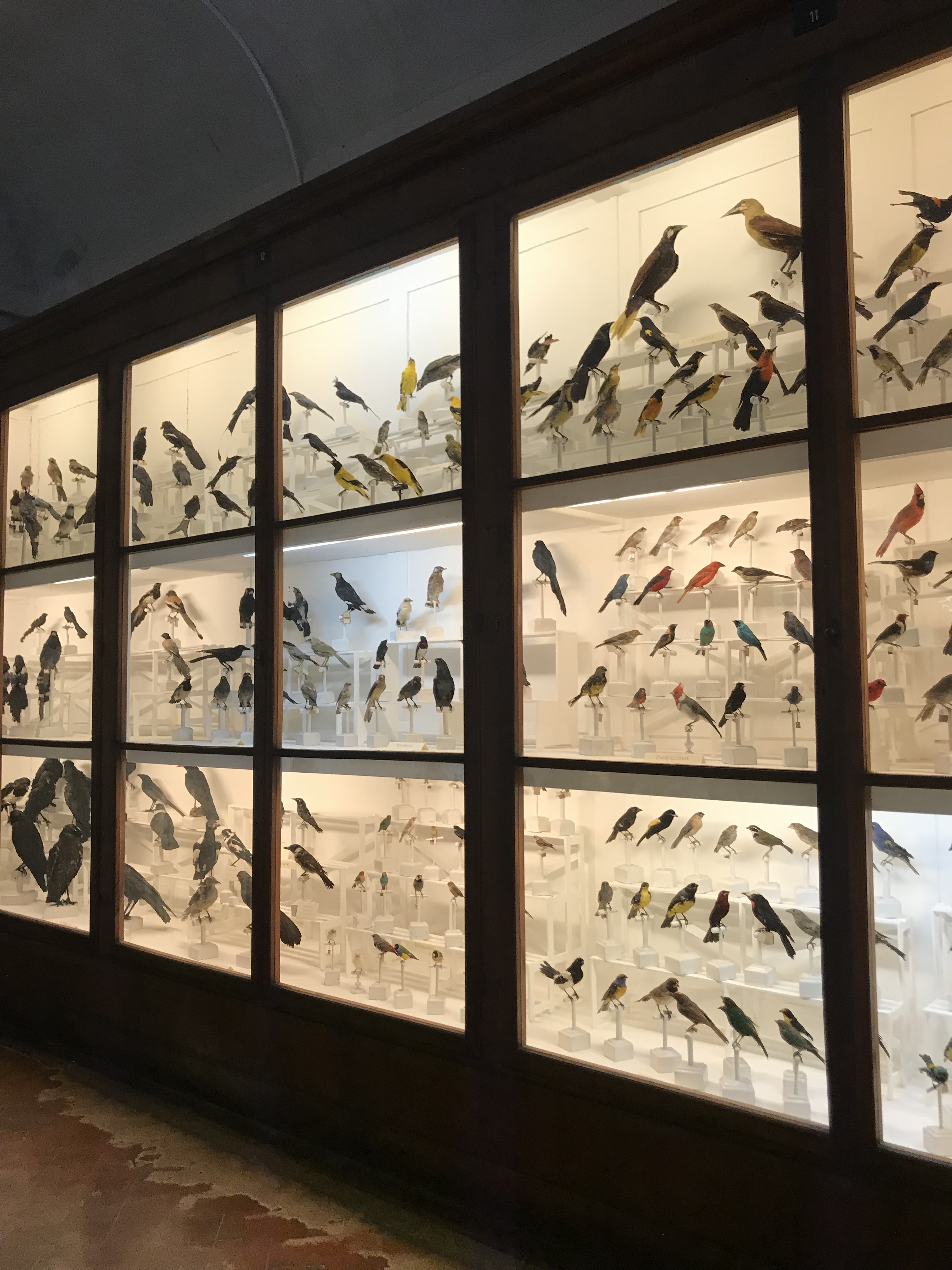

La Specola’s collection
For the project we were given the task to observe the current branding of a small museum in Florence and design a new logo, and rebrand it’s collateral.
Starting this project I visited the Museum in Florence to see it in person and understand what it was about. La Specola is a part of the Natural History Museum of Florence, close to the Palazzo Pitti. It is a very old institution with a unique collection of medical wax anatomical figures, taxidermized animals and a rock collection.
An issue with the current museum branding was lack of cohesive brand existing. Another was that the entrance did not standout, and was very hard to find. No singular logo mark existed and The name “La Specola” wasn’t shown clearly anywhere. The museum did not stand out yet having a unique collection.

I wanted to design a distinctive, adaptable mark that could be interchangeable with all of the museum branding that existed. I also wanted an easily recognizable brand to direct people into museum.
For inspiration I looked at how natural history museums around the world tackled the challenge of representing the different elements the museum has in one cohesive logo.
For inspiration I looked at how natural history museums around the world tackled the challenge of representing the different elements the museum has in one cohesive logo.
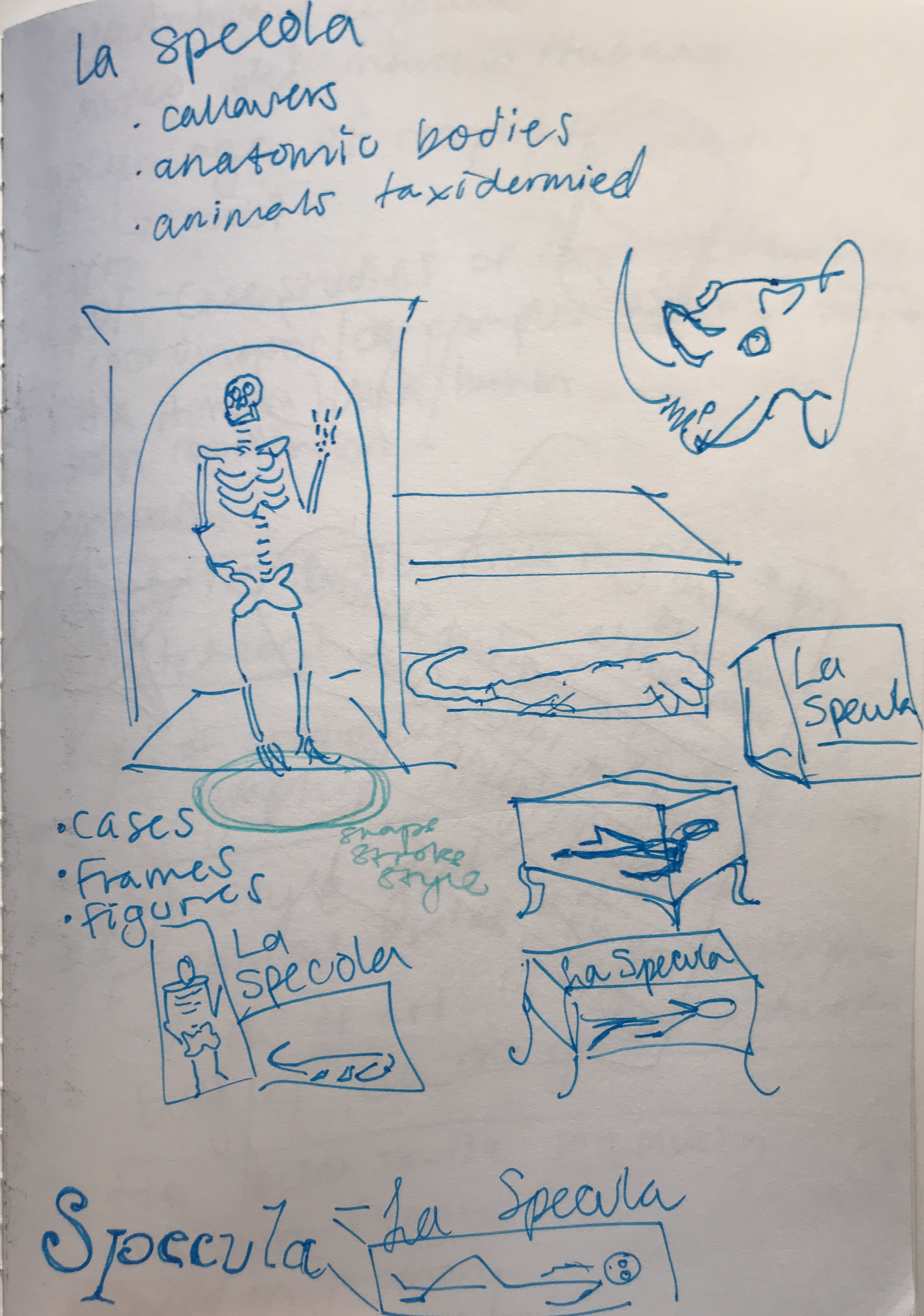
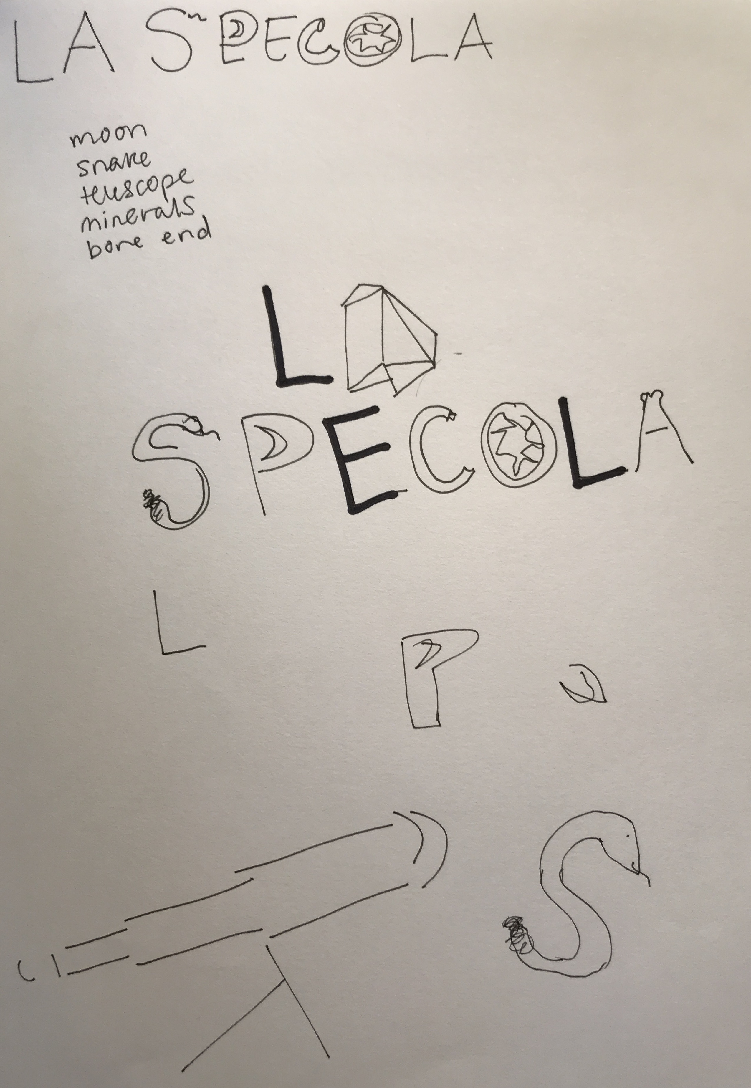
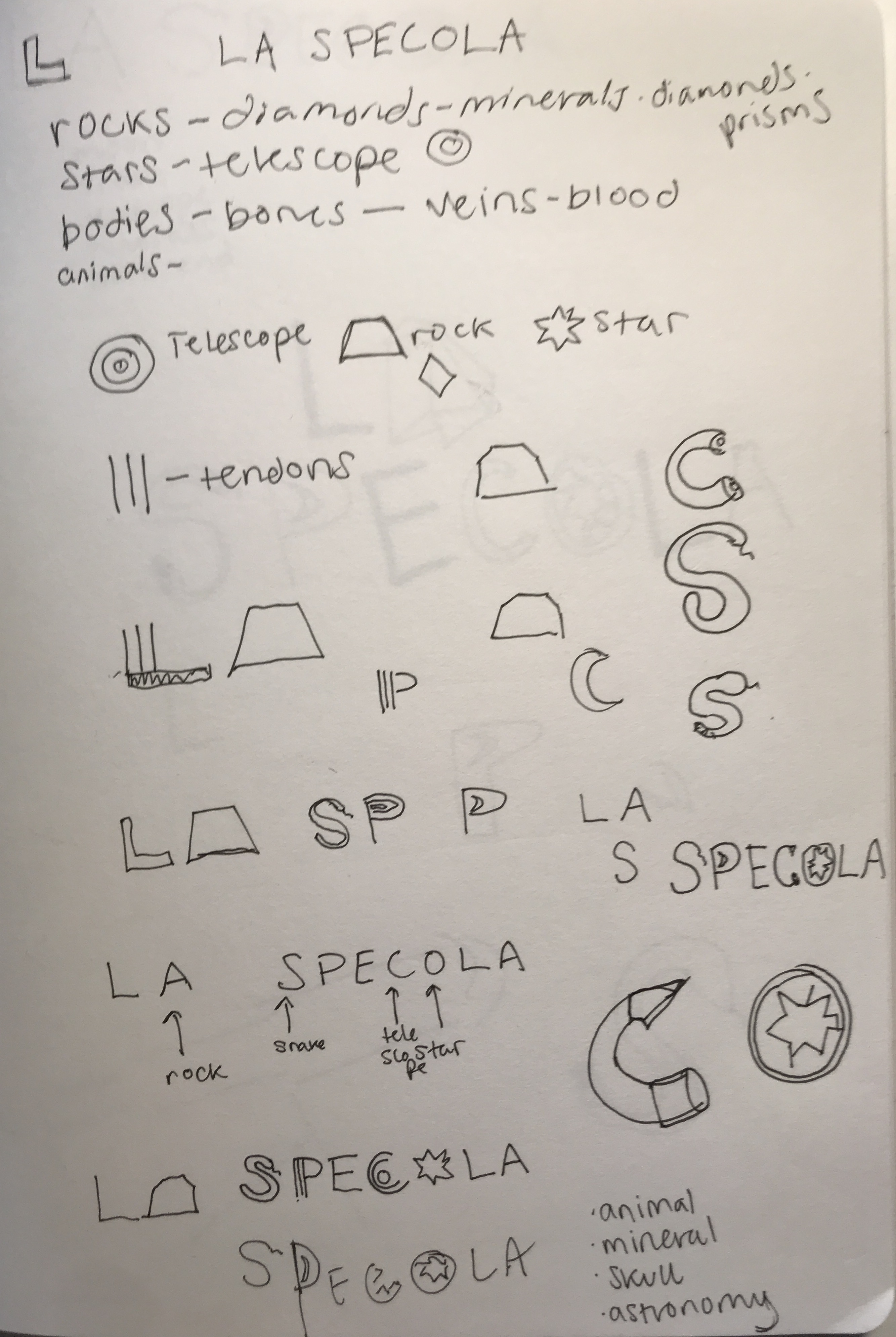

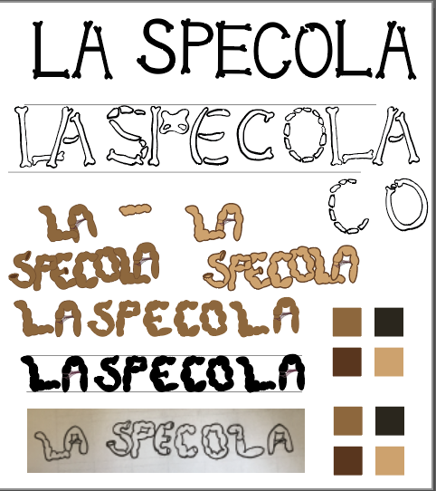
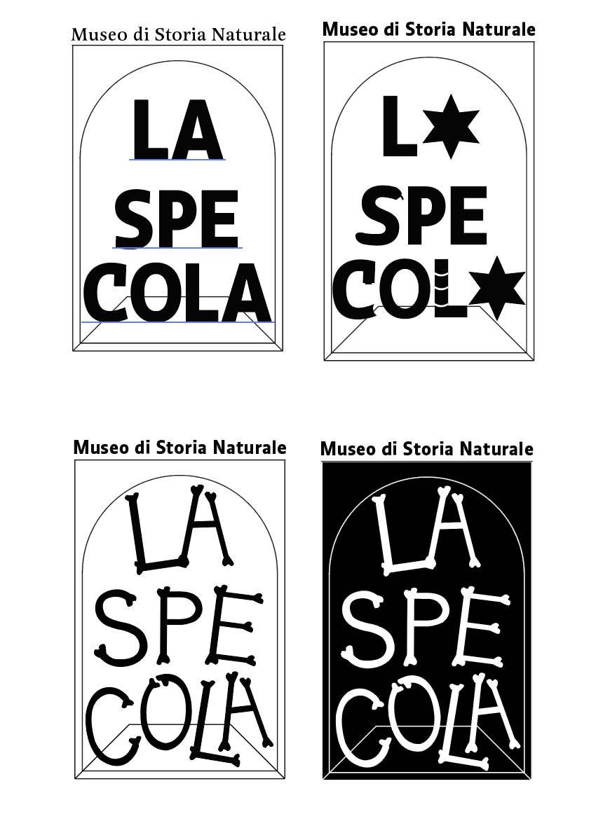
I went in with the idea of a display case because it’s a very key visual element in La Specola. The museum is filled with display cases full of bones, animals and minerals. The display case motif is versatile, and it can house anything inside of it to represent the elements of the museum. I chose the typeface after testing several because it seemed to match the historical tone with its elegant serifs but also modern and relevant.
Final Logo, normal and reversed
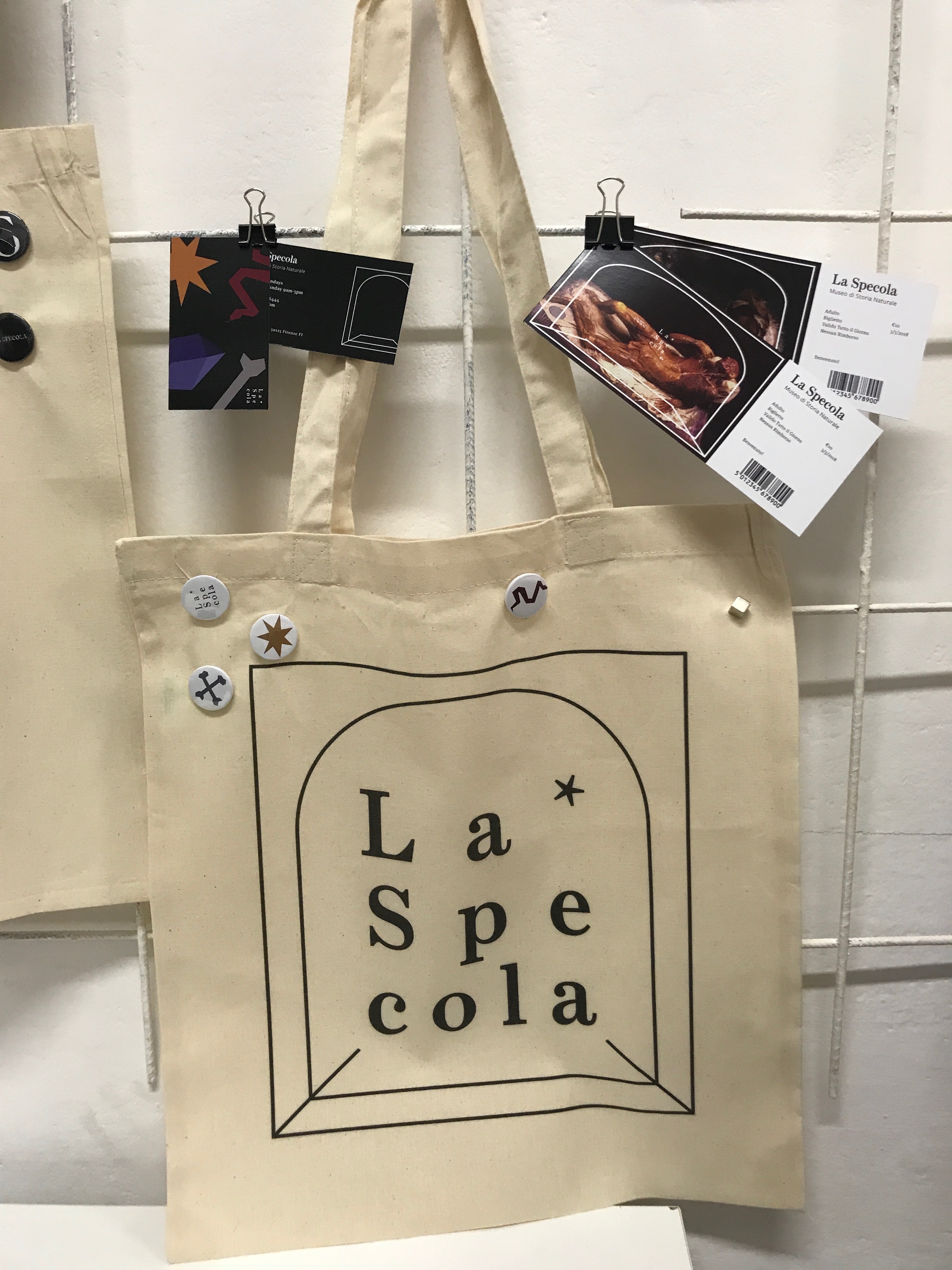
Final collateral