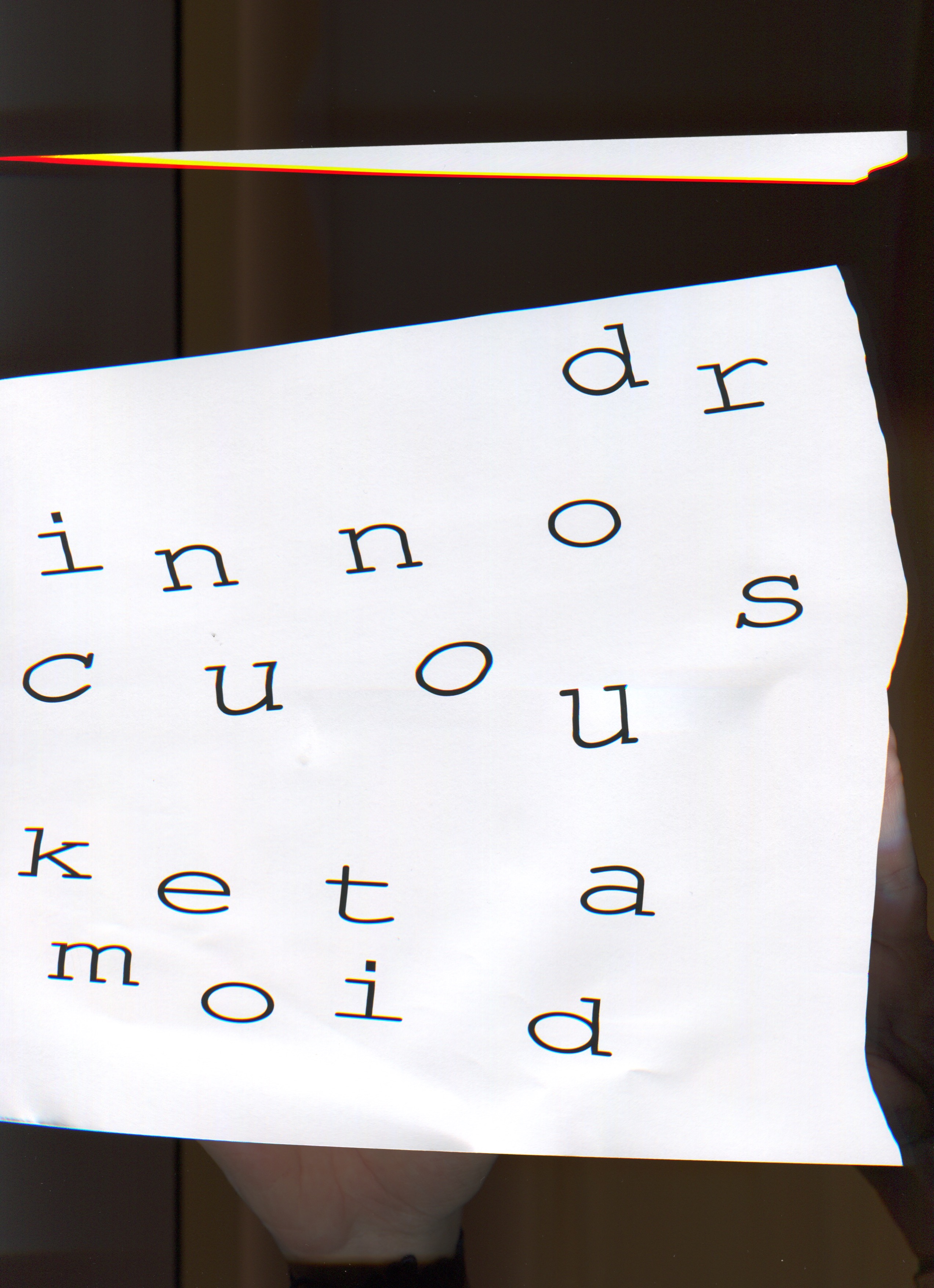
Dr. Innocous-Ketamoid Video / Concepting / Animation / After Effects / Spring 2020
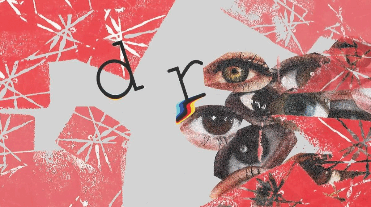
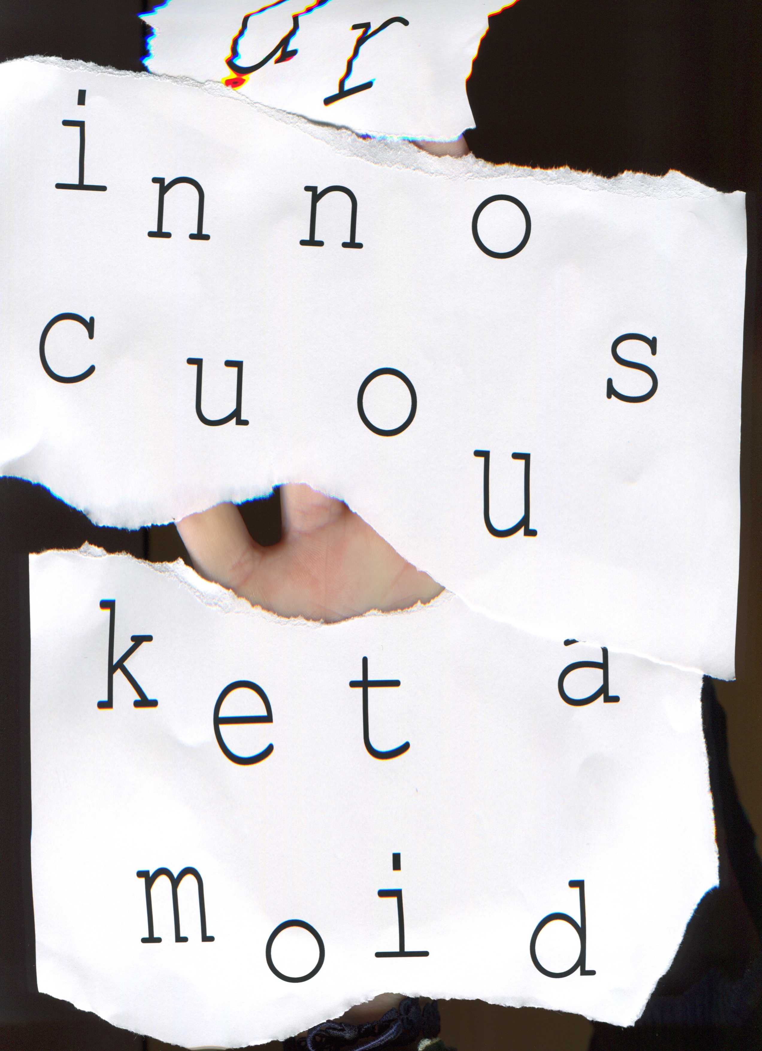
Still from video
The 30-second abstract animation video is inspired by the song ‘Dr. Innocuous-Ketamoid’. It is an untraditional sound as music, and lacks a steady rhythm, giving it a very jarring and disconcerting tone.
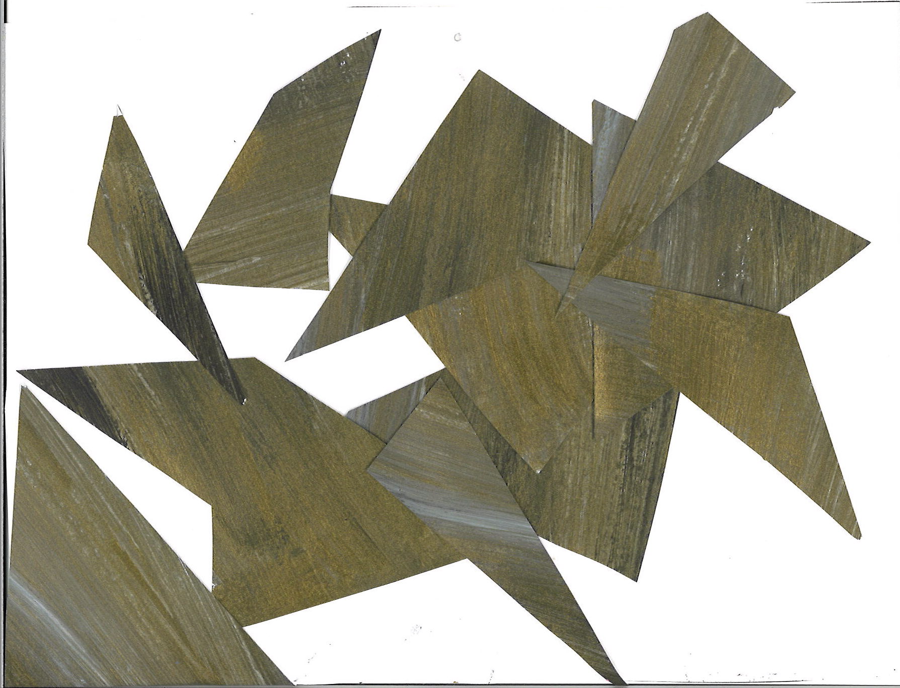
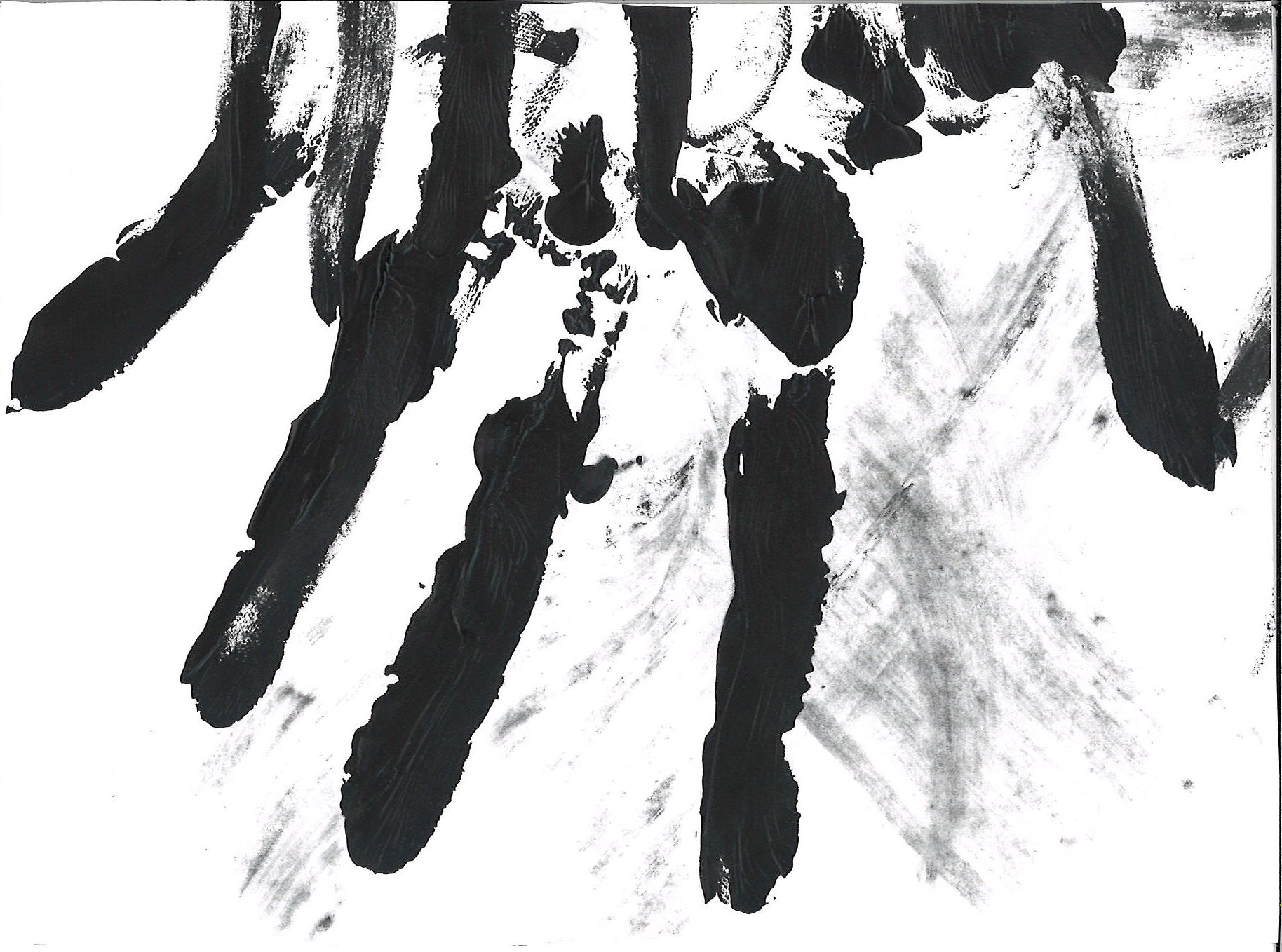
During the image making process, I defined the energy of the song as three words: jarring, disconcerting and futuristic. I used these keywords to lead me in finding the main visual voice of the video. I explored analog mediums such as stamping, hand painting and scanning, to bring the human touch needed to portray these strong emotions. Black, white and red were the key colors throughout the video, and repetitive patterns demonstrate the constant repetitive sounds of white noise during the song. The typeface, Courier, was a futuristic choice for its time, being adapted for the IBM typewriter. I set the title of the song to this typeface, and abstracted it to add to the disconcerting and jarring tone of the piece.
Process Scans
While story-boarding the final images, I had put together an ‘alien’ narrative, a sense of other invading a space. The final product communicated the key tone words that I started off with when first venturing into this project. The imagery, from collaging to stamping matched the tone of the song as they were visually static-like, moving perfectly to the non-beat of the song.