120/80 / Concepting / Branding / Logo / Business Card / Summer 2019
 Business cards with logo
During my summer internship at Glantz Design I was given the assignment to help design a logo for a new client that had just started a PPC management and digital marketing company,120 over 80, and did not have any branding yet. The client wanted the logo to be simple yet interesting and very approachable to their audience. They liked the idea of using numbers in their logo and a ‘/’ between them to represent the ‘over’ part of their name.
Before starting the sketching process I looked at the logos of other SEO, SEM and PPC companies. I also looked at how other companies made logos with numbers. This was very helpful to see the many different ways people played with numbers and negative space.
Before starting the sketching process I looked at the logos of other SEO, SEM and PPC companies. I also looked at how other companies made logos with numbers. This was very helpful to see the many different ways people played with numbers and negative space.

tote bag with logo
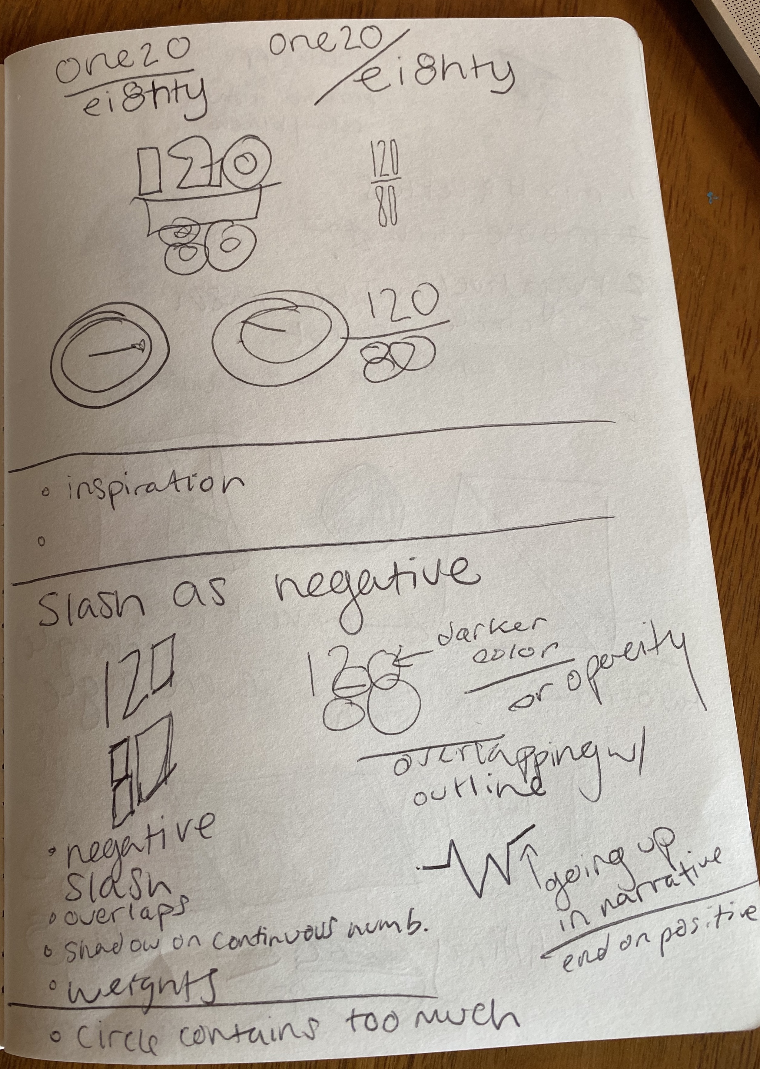
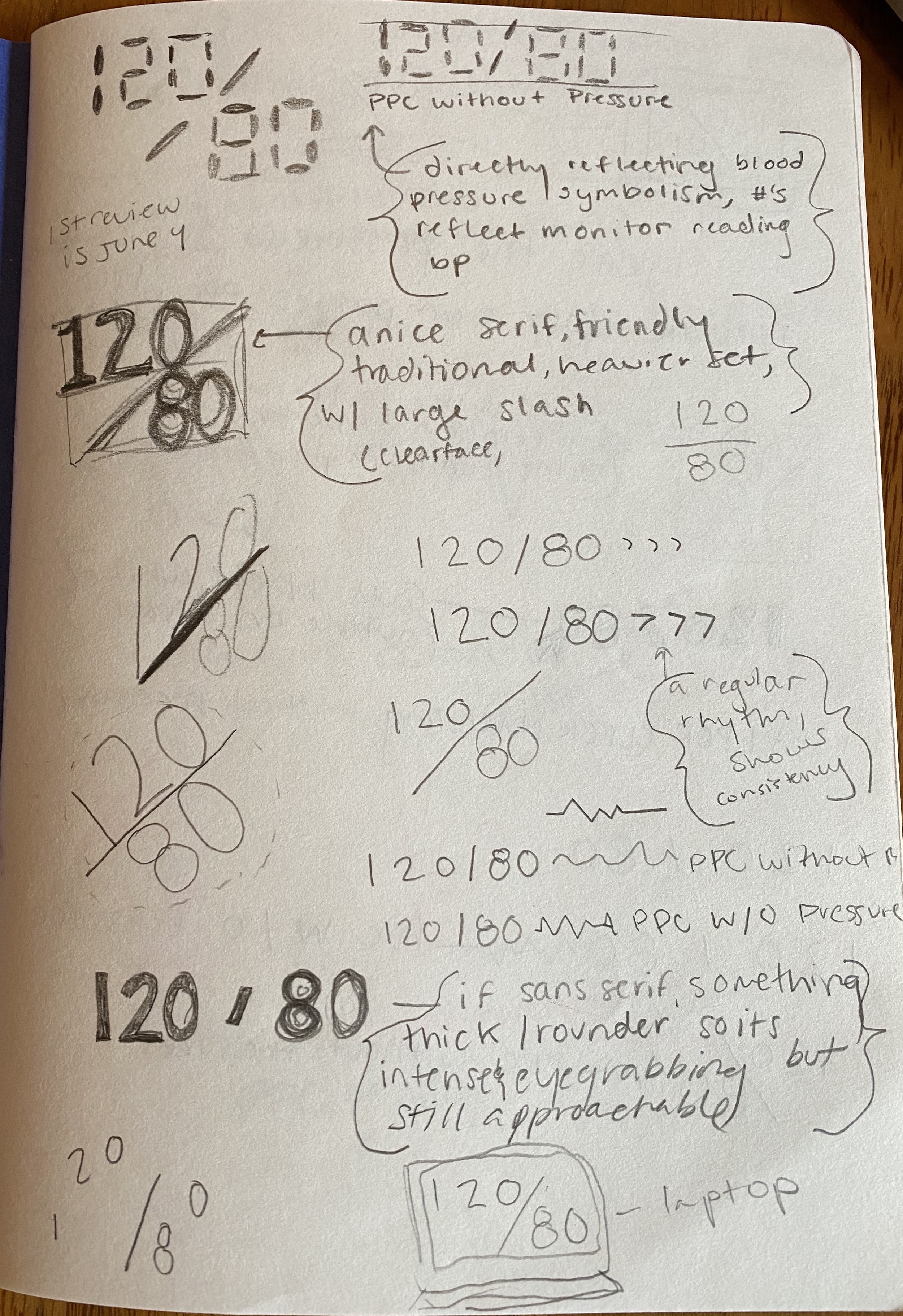
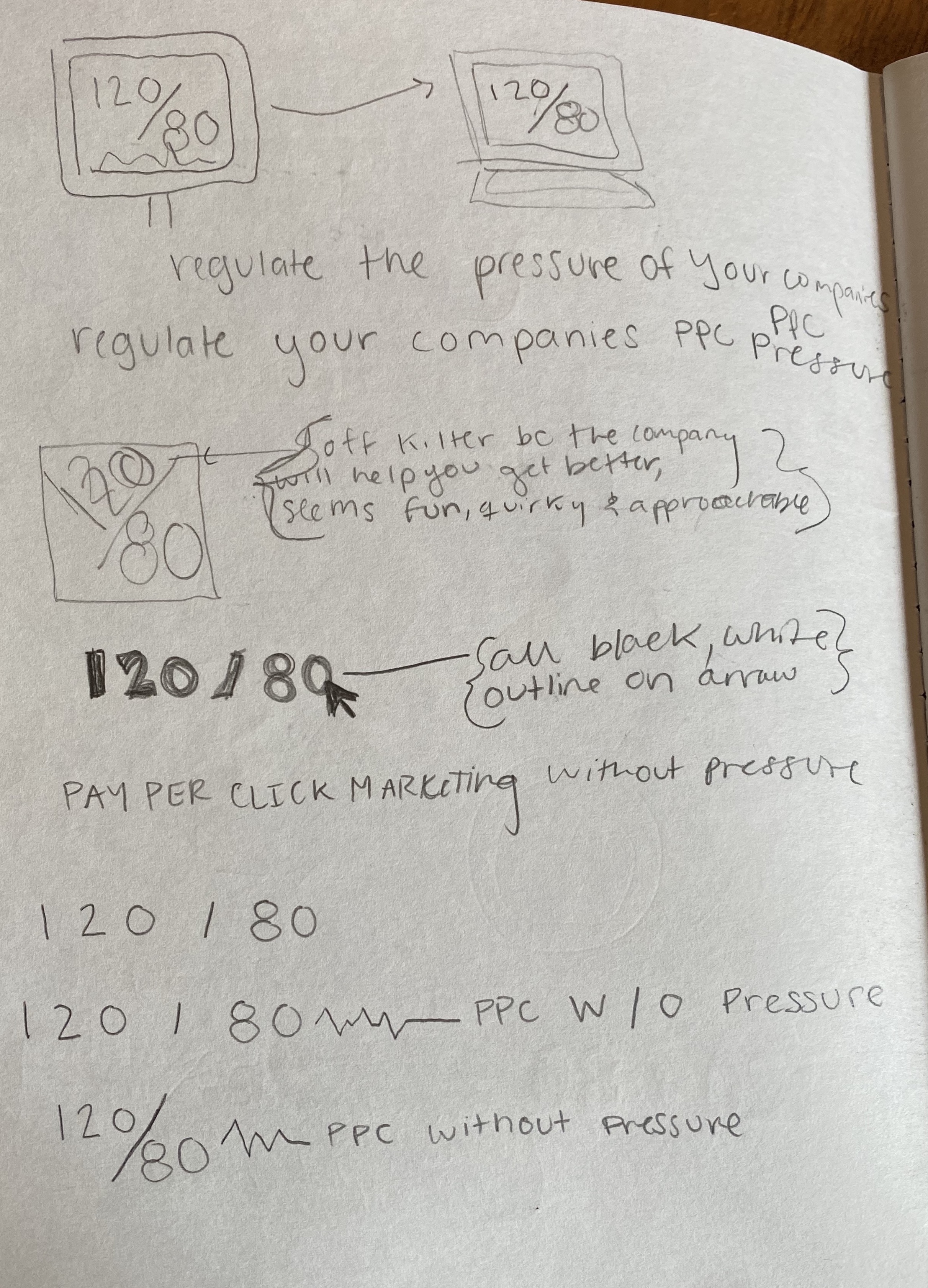
Initial sketches
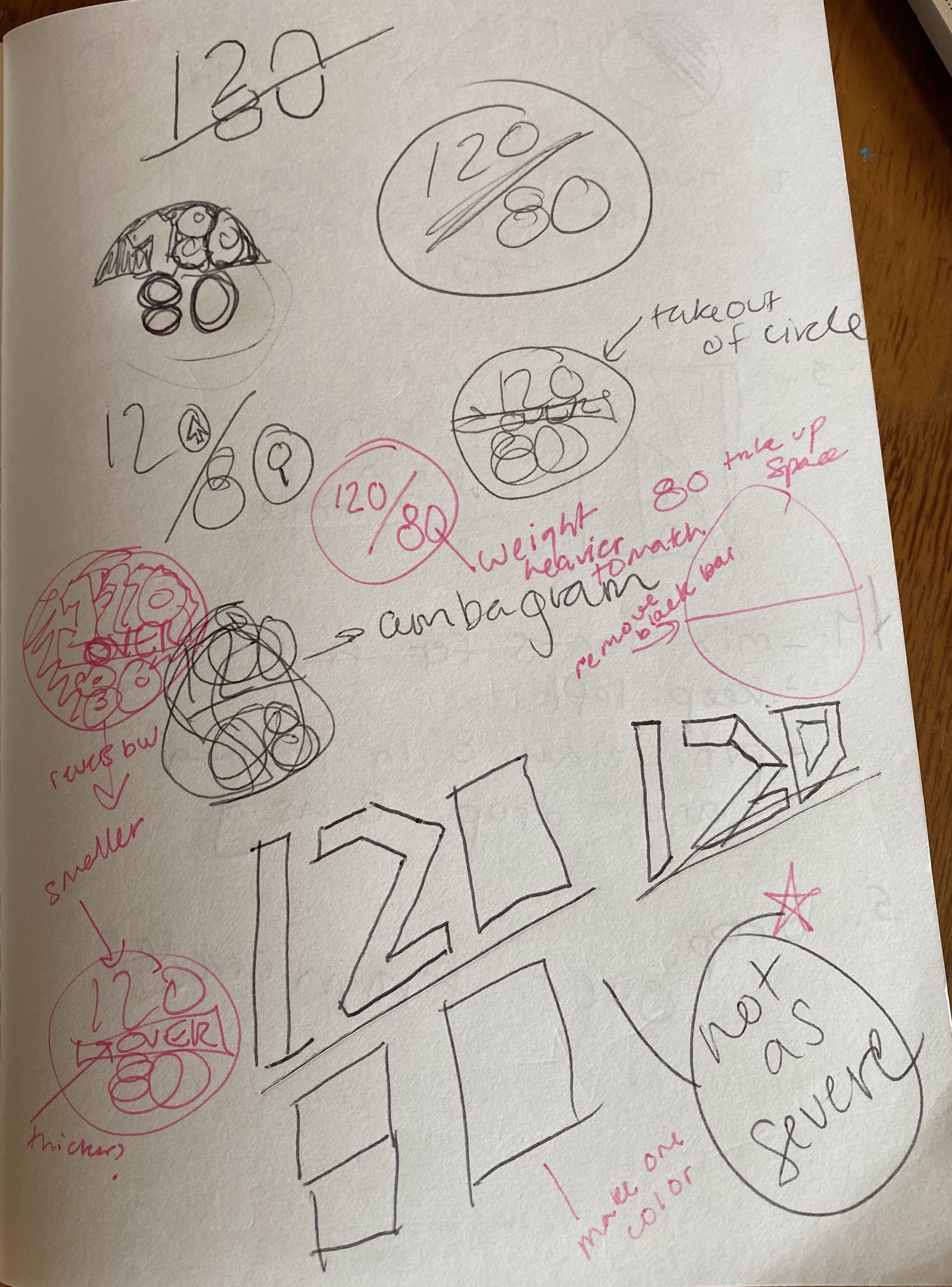
Finalized logo concepts presented to client
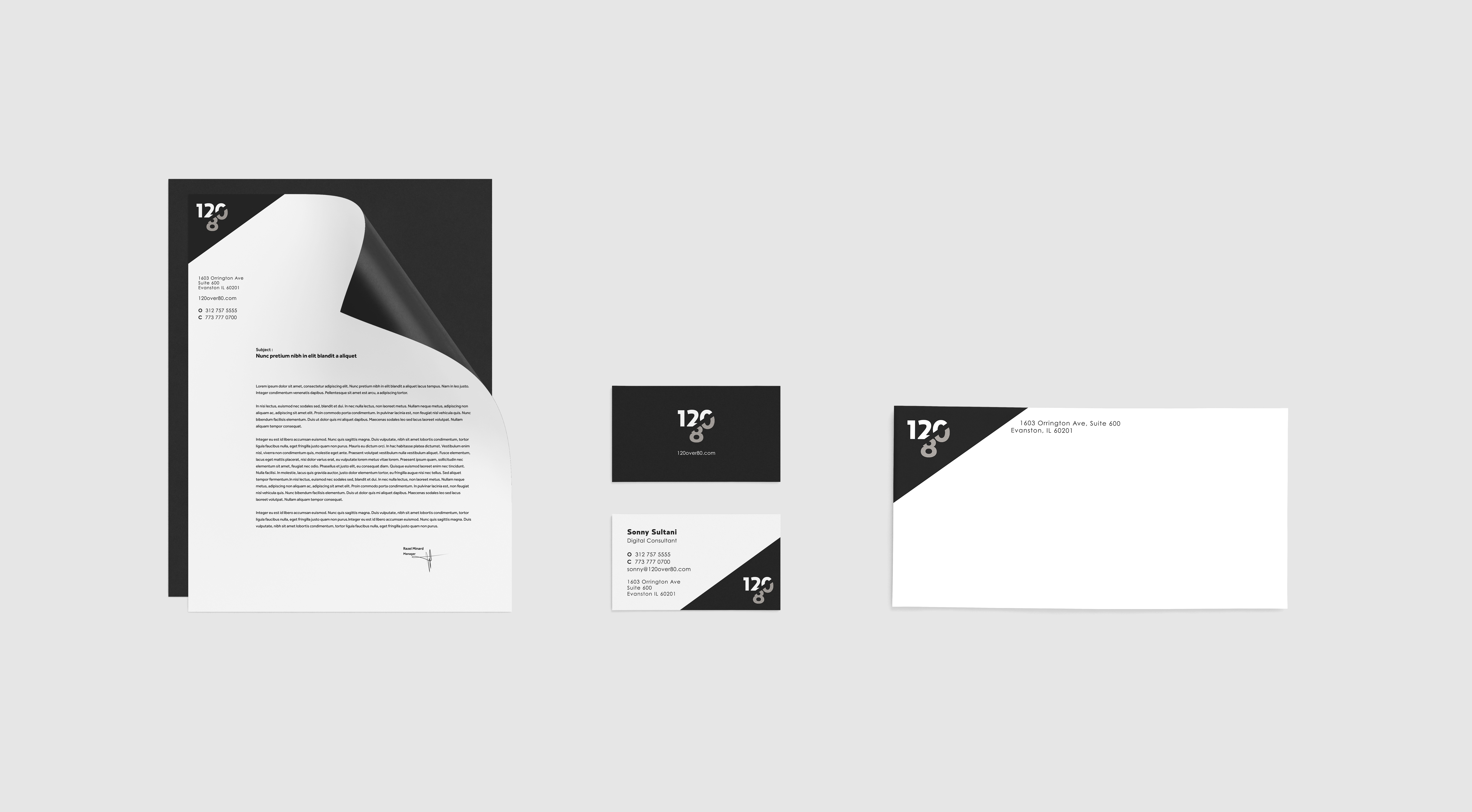
After we presented several concepts to the client, they gravitated towards my negative dash going through the numbers to represent 120 over 80. The typeface chosen, Relay Black, was thick and bold enough to catch attention but also playful with its varying widths. I chose the colors for the brand, neutral grays, to highlight the professionalism of the company. I also had a hand in designing the logo style guide for the client to ensure proper use of the logo.
Brand guideline and
final logo
final logo
Collateral